Combo Chart in PowerPoint
When your data has multiple dimensions, and you want to display both values and trends in a single chart, the combo chart is your go-to solution. By combining columns and lines, this chart offers a dynamic way to present contrasting yet complementary datasets effectively.
With the Slidedoer PowerPoint Add-in, creating and customizing combo charts is effortless, enabling you to turn complex datasets into meaningful insights. Let’s explore what makes combo charts essential, their applications, and how you can create one with Slidedoer.
What is a Combo Chart?
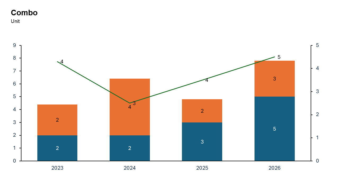
A combo chart is a hybrid visualization that combines two chart types—columns and lines—to display different kinds of data in one chart.
Columns: Represent individual data points or totals, ideal for discrete values like sales, revenue, or costs.
Line: Highlights trends, averages, or metrics over time, providing a broader context.
- Monthly revenue (columns) and cumulative growth rate (line).
- Product sales across categories (columns) and their market shares (line).
Why Use It?
Combine Two Perspectives
Show both individual values (columns) and trends or relationships (line) in a single view.
Improve Data Interpretation
Effectively highlight the connection between two datasets that may otherwise be difficult to compare.
Save Space
By combining two chart types, you eliminate the need for separate charts, making your slide cleaner and more concise.
Add Depth to Your Analysis
Provide a more comprehensive view of your data by displaying multiple dimensions simultaneously.
Best Use Cases
- Sales vs. Growth Rates: Compare monthly or quarterly sales (columns) with growth rates over time (line).
- Budget vs. Actual Expenses: Show planned budgets (columns) alongside actual expenses (line) to highlight variances.
- Revenue vs. Market Share: Display revenue from product categories (columns) with a line showing market share percentages.
- Production vs. Efficiency: Highlight production volumes (columns) and efficiency rates (line) across time periods.
When to Avoid It
Avoid using combo charts if the datasets are too detailed or complex, as this may make the chart difficult to interpret. If the line and columns overlap or use very different scales, consider splitting the data into separate visualizations.
Tips for Better Charts
- Use a Secondary Y-Axis if Necessary: If the columns and line use different scales, add a secondary Y-axis for clarity.
- Distinguish Between Columns and Line: Use distinct colors, line styles, or markers to differentiate the line from the columns.
- Add Data Labels: Include labels for key data points to enhance readability.
- Keep It Simple: Avoid clutter by limiting the number of categories and data series.
- Provide Context: Include a descriptive title, axis labels, and a legend to make the chart self-explanatory.
Examples of Combo Bar Charts
Monthly Revenue and Growth Rate
Show revenue for each month (columns) with a line illustrating the cumulative growth rate.
Budget vs. Actual Spending
Compare departmental budgets (columns) against actual expenditures (line) over a year.
Sales Volume and Market Share
Highlight sales volumes (columns) alongside market share trends (line) for different product categories.
Energy Production and Efficiency
Visualize energy production (columns) and efficiency levels (line) across facilities.
Advantages of Combo Charts
- Multi-Dimensional Analysis: Display multiple types of data in one chart for a comprehensive view.
- Efficient Use of Space: Combine two datasets into one visual, saving space on your slide.
- Flexible and Customizable: Adjust axes, colors, and formatting to suit your needs.
- Powerful with Slidedoer: Create stunning combo charts in minutes with professional-quality results.
Conclusion
The combo chart is a powerful visualization tool for presenting both values and trends in a single, cohesive view. Whether you're comparing sales to growth rates, budgets to expenses, or production to efficiency, this chart type simplifies complex data and brings clarity to your analysis.
Related Charts
Waterfall Build Up Chart | | Waterfall Build Down Chart | | Combo Chart | | Error Bar Chart | | Line Chart | | 100% Stacked Mekko Chart | | Stacked Mekko Chart | | Stacked Bar Chart | | Clustered Bar Chart | | 100% Stacked Bar Chart | | Stacked Column Chart | | Clustered Column Chart | | 100% Stacked Column Chart | | 100% Stacked Area Chart | | Stacked Area Chart | | Scatter Plot Chart | | Bubble Chart | | Pie Chart | | Doughnut Chart | | Football Field Chart | | Gantt Chart
Create Better Charts in Seconds
Use Slidedoer PowerPoint Add-in to instantly build professional combo charts and 60+ business layouts.
Try Slidedoer